Sifted
Junior Product Designer
London, UK (Remote)
2023-2024
Figma
Figjam
User Research
Product
Cross-function
Editorial
At a glance:
Sifted is a European tech & startup media platform — sharp journalism for founders, operators, and investors who want signal, not noise.
I joined as a graphic designer handling editorial layouts and marketing assets, but the role evolved quickly. Within months I was deep in product territory, working cross-functionally to redesign key pages of the platform. This is where my practice really clicked: i realised that good UI isn't just about how things look — it's about how people move through information, and what makes them want to stay.
Focus: Taking a detailed example
1. Homepage Redesign — from content chaos to clear flow
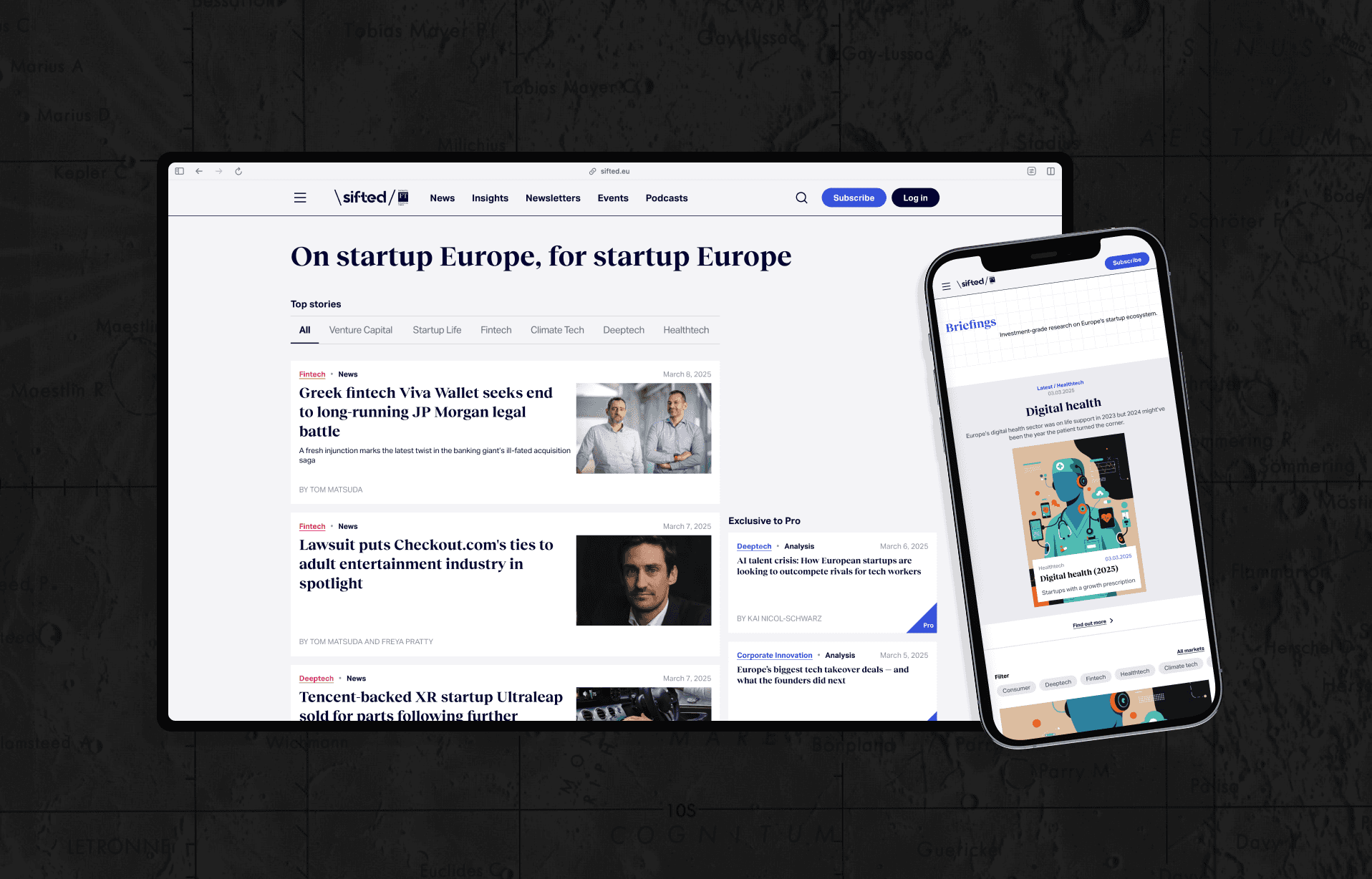
A media platform's homepage has one job: help the right person find the right thing, fast. The old Sifted homepage wasn't quite doing that.
Challenge:
The page was trying to do too much at once — breaking news, long-reads, events, newsletters, all competing for the same eyeballs without a clear hierarchy. Users arrived curious and left before they found what they were actually looking for. Bounce rates were high. Engagement beyond the headline articles was low.
The problem wasn't too much content. It was too little guidance.
Methods & Process:
Working with the team, i conducted user interviews and mapped content consumption patterns across different visitor types — first-time readers, returning subscribers, event-goers. The research made one thing clear: people weren't overwhelmed by quantity. They were overwhelmed by the lack of a visual logic that told them where to look next.
I then used data mapping to identify the highest-value content categories and how they were currently (mis)represented in the layout.
Solutions:
I restructured the homepage around a cleaner information architecture — one that guides the eye rather than bombards it. Key decisions included:
A modular card system flexible enough to handle different content types while keeping the visual language consistent across the page
A tightened typographic hierarchy that signals editorial importance at a glance
Deliberate whitespace as a design tool — creating breathing room that actually reduces cognitive load rather than just looking "minimal"
A personalised content recommendation layer surfacing relevant articles without feeling algorithmic or cold
The goal was to make the page feel like a curated editorial experience — the kind you want to scroll, not escape.
Working at Sifted taught me that growing into a role is a skill in itself. I arrived with graphic design instincts and left with a product design practice — and a much deeper appreciation for what it means to design for real reading habits, not imagined ones.
1. Homepage Redesign — from content chaos to clear flow
hkhks